The 60-30-10 Color Rule: How to Balance Any Room's Palette
A classic interior ratio that guarantees visual balance without making a space feel busy or sterile.
Why the ratio works
Choosing interior paint and accent colors often feels overwhelming. The 60-30-10 Rule is a classic interior design ratio that guarantees visual balance without making a space feel busy or sterile.
Instead of asking which colors go together, the rule asks how much of each color a room should hold. Proportion, not hue, is what makes a palette feel resolved.
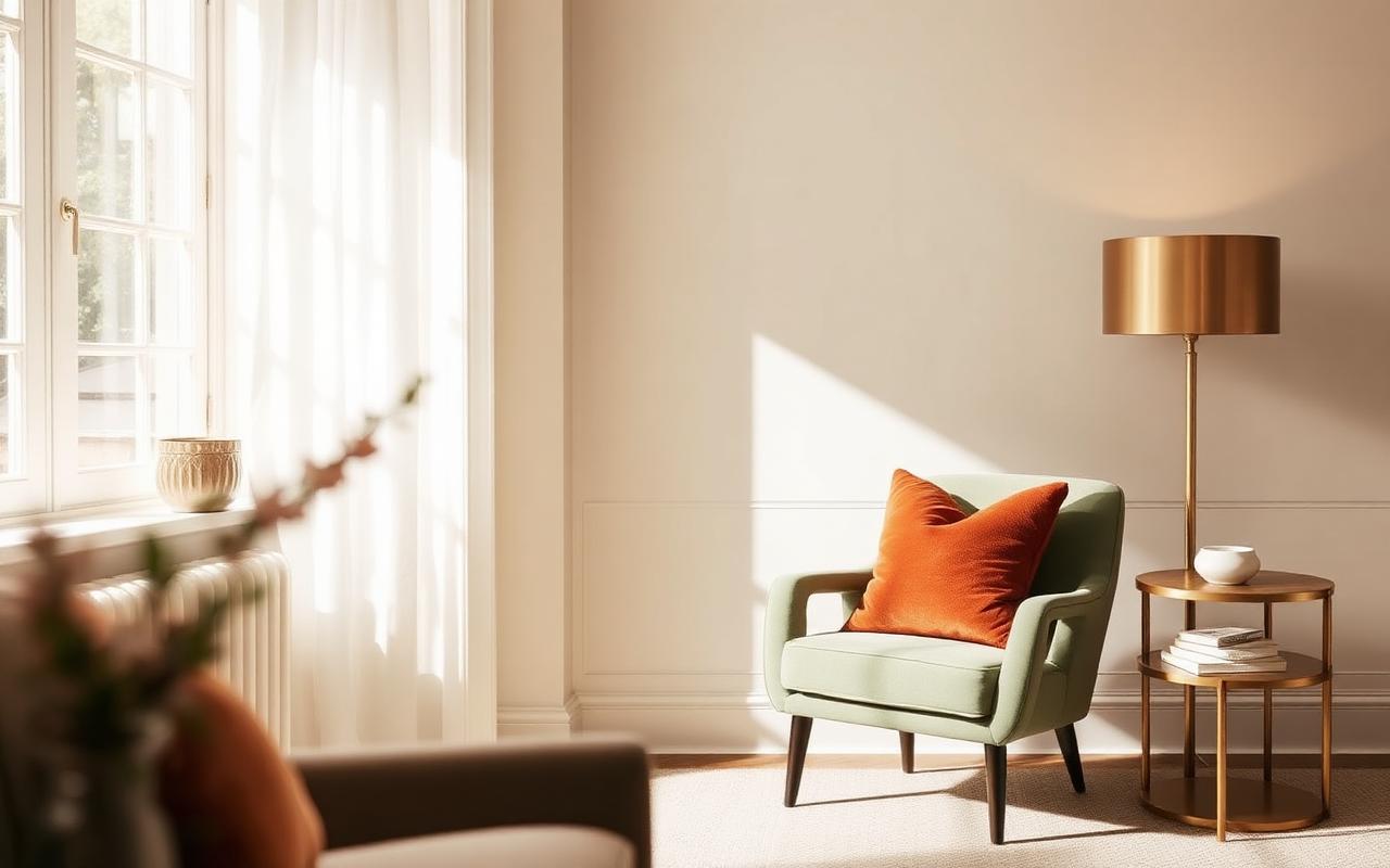
60% Dominant Color — the foundation
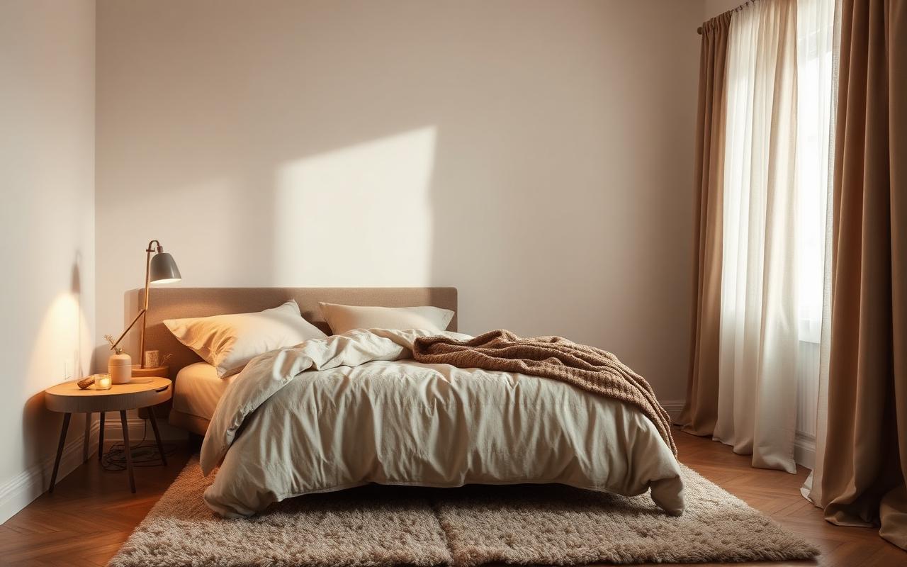
This serves as the background canvas. It usually consists of your walls, large rug, or primary furniture pieces like a couch.
Stick to neutral, muted tones — such as cream, warm linen, or soft off-white. The dominant color should recede so everything placed on top of it reads clearly.
30% Secondary Color — the structure
This creates visual interest and depth. It appears in curtains, accent chairs, bed linens, or featured cabinetry.
Earthy, desaturated tones like sage green, terracotta, or warm taupe work exceptionally well here because they hold their character in both daylight and lamplight.
10% Accent Color — the spark
This brings character to the room. Use it sparingly in throw pillows, artwork, lamps, or small decor objects.
Metallics (brushed brass or matte black), deep jewel tones, or vibrant florals belong in this category. Because the accent is small, it can be the boldest choice you make.
- Before buying paint or furniture, extract your exact hex codes from your inspiration photos using PinPath.
- Map each extracted shade to the 60-30-10 ratio to preview how the room will feel before spending a dollar.
- Test dominant paint colors on two walls with different light exposure before committing.
Yes — keep the 60-30-10 proportions and let extra colors live inside the 10% accent band as tonal variations.
Treat warm wood tones as part of your 30% secondary band; they carry the same visual weight as a fabric or cabinetry color.